Consider an investor who started holding PLTY at its October 2024 launch — watching distributions arrive month after month while PLTR rocketed from $25 to $90+. Sounds like a win, right?
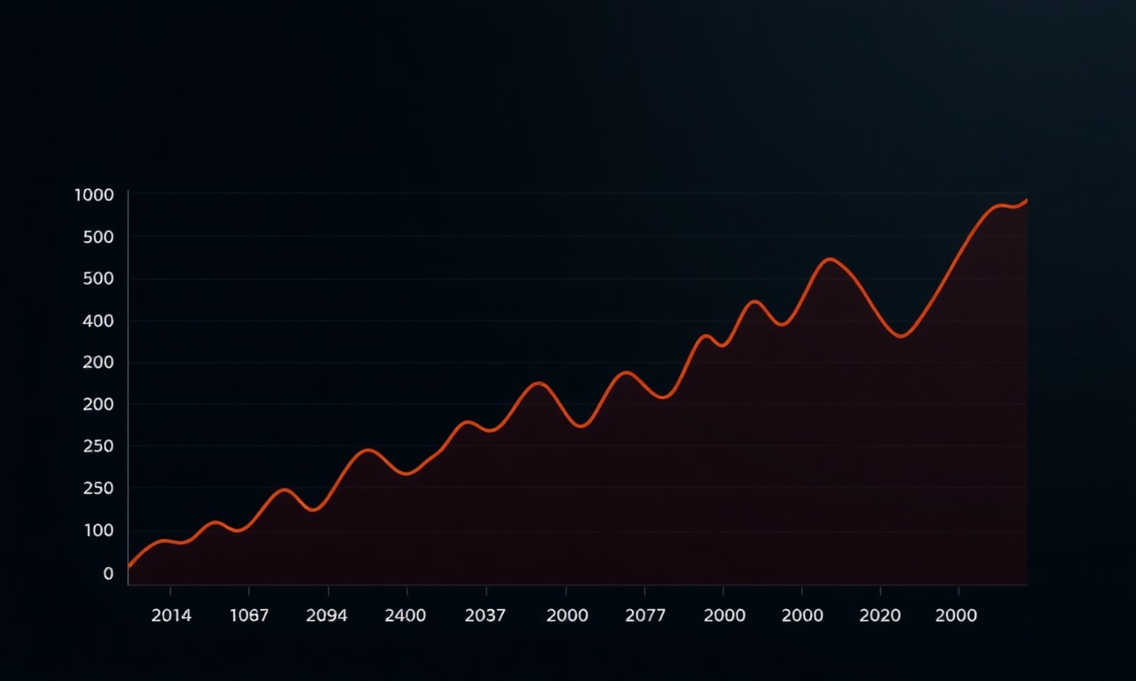
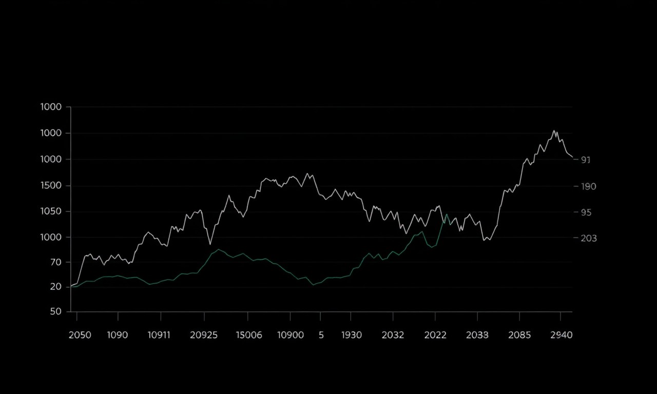
Here’s what the NAV chart actually looks like: PLTY consistently underperforms PLTR on a total return basis by roughly 10% annually. The income is real. The erosion is also real. And the question I had to answer — the question every covered call ETF investor eventually confronts — is whether the math works in my favor.
That’s what this article is about. I’m going to break down yield ETF NAV decay using PLTY, TSLW, HOOW, GDXY, and MSTY as worked examples — with MSTY as the cautionary tale. No abstractions. Real math, real numbers, real positions.
TL;DR
- NAV decay is the structural cost of covered call ETF income: you trade upside for monthly distributions. At 1.5% monthly decay, you’re in a capital destruction loop.
- Total return (NAV change + distributions) is the only number that matters: an 18% yield with 10% NAV erosion = 8% actual return, not 18%.
- The math works in sideways/bear markets and high-vol environments, but breaks in strong bull markets with low vol — when you’re capped on upside AND earning thin premiums simultaneously.
Tracking your ETF’s real total return? Robinhood Gold shows total return including distributions — not just NAV. CoinTracker handles tax reporting when you eventually rebalance.
What Covered Call ETFs Actually Do (Before We Talk About Decay)
The pitch is simple: the fund owns shares of a stock (or has synthetic exposure), sells call options on that stock, and distributes the collected premium to you as “income.”
Every week or month, the fund sells a call option. That means agreeing to cap the upside of the underlying stock at a specific price (the strike). In exchange, a buyer pays the fund a premium upfront — and that premium flows to you as a distribution.
The trade-off is straightforward: you get income now, and you give up upside later.
The problem is that yield marketing focuses entirely on the “income now” part and buries the “upside you gave up” part. Over time, that buried cost shows up as NAV decay — a slow, steady erosion of the fund’s price per share.
Here’s the basic mechanics:
- TSLA trades at $240. TSLW sells $250 calls, collects $8 premium per share.
- TSLA rallies to $280. Those calls get exercised. The fund had to sell TSLA at $250.
- You pocketed $8 in income. You missed $30 in upside. Net: -$22 opportunity cost per share.
That missed upside doesn’t disappear — it shows up in the NAV not keeping pace with the underlying. Repeat that every week for a year and you’ve got a structural, persistent drag.
The Five Forces That Kill NAV in Bull Markets
1. The Strike Selection Trap
How far out-of-the-money a fund writes its calls determines everything. Write calls 15% OTM and you give the underlying room to run before getting capped. Write them 3% OTM and you capture more premium — but you get assigned almost every time the stock moves.
PLTY writes calls roughly 10–15% OTM monthly. That’s why its yield is “only” 15–25% — there’s actual breathing room built in.
TSLW writes calls roughly 5% OTM weekly. Higher yield, tighter cap, faster erosion in rallies. MSTY writes weekly calls on a mega-volatile MSTR — which is where you get headline 110% yields and 2.5%+ monthly NAV decay.
Higher yield = tighter strike selection = faster decay in bull markets. It’s not a bug. It’s the design.
2. Option Premium Math: You Get Paid Upfront, but the Bill Comes Later
Premium is collected at the moment the call is sold. The upside cap, if it matters, happens later when the stock rallies above the strike. This creates a timing illusion.
You feel like you’re collecting free income every month. But the true cost only materializes when the underlying makes a big move — and by then, you’ve already spent the distribution.
In sideways markets, the stock rarely tests the cap, so the premium feels like pure income. In bull markets, every distribution is partially offset by an invisible tax: the gains you couldn’t participate in.
3. Volatility Regime Dependency
Option premiums are priced on implied volatility. High vol = fat premiums. Low vol = thin premiums.
This means the same fund, same strategy, same underlying performs completely differently depending on market conditions.
TSLW in 2023 (high VIX, choppy TSLA): weekly premiums of 3–4%. In 2024–2025 (lower VIX, trending TSLA): premiums dropped to 1–1.5%. Same fund. Half the income.
Meanwhile, in low-vol bull markets, the underlying is actually moving up — which means the upside cap gets tested more often. You’re earning less from premiums while giving up more upside. That’s the worst possible combination.
4. Return of Capital: Your Money Taxed as Income
When genuine premium income isn’t enough to cover the promised distribution, funds make up the difference with return of capital (ROC). They’re literally paying you back your own investment and calling it a distribution.
The kicker: you still owe ordinary income tax on ROC distributions.
You receive $110 per $100 invested (MSTY scenario). You pay taxes on $110. But $75 of that was your own capital being returned. Your actual investment base just dropped by $75. Next year, distributions will be lower because the fund is working from a smaller capital base. The spiral begins.
MSTY breakdown: ~25% genuine income, ~75% ROC. PLTY: ~82% genuine income, ~18% ROC. GDXY: ~95% genuine income, ~5% ROC. The gap between these three funds tells you everything about long-term viability.
5. Weekly Reset Compounding Drag
TSLW resets every week. Fifty-two resets per year. Each reset incurs transaction costs, slippage, and the mathematical reality of daily rebalancing compounding.
In theory, 1.2x weekly leverage should give you 20% more return annually. In practice, choppy markets eat that leverage premium alive. TSLW’s actual annual tracking is 0.85–0.95x the underlying — a 0.25–0.35x underperformance. You’re not getting 1.2x; you’re getting 0.9x with a higher expense ratio.
PLTY’s monthly structure is more efficient — fewer resets, less slippage, longer premium duration. That’s part of why PLTY’s NAV decay (0.5–1.2% monthly) is lower than TSLW’s (0.8–1.5% monthly) despite similar yield brackets.
The Math Framework: Total Return Is the Only Number That Matters
Here’s the formula. Write it down:
Total Return = (Ending NAV − Starting NAV + Distributions Received) / Starting NAV
That’s it. That’s the whole game.
Example using PLTY:
– Buy at $100 NAV
– Receive $18 in distributions over 12 months (18% yield)
– Ending NAV = $95 (5% erosion)
– Total Return = ($95 − $100 + $18) / $100 = +13%
Not 18%. Thirteen. The yield headline was 18%, but the actual return was 13% after NAV erosion.
Now run the same calculation in a bull market where PLTR keeps ripping:
– Buy at $100 NAV
– Receive $18 in distributions
– Ending NAV = $90 (10% erosion from missed upside)
– Total Return = ($90 − $100 + $18) / $100 = +8%
Meanwhile PLTR itself returned 80%. You made 8%. You gave up 72 percentage points of upside to collect 18% in distributions.
Is that the right trade? Maybe — if you needed the income. But it’s a trade, not a free lunch.
The 1.5%/Month Red Flag Threshold
Annualized, 1.5% monthly NAV erosion is an 18% annual drag. For a fund paying 18% distributions (which most can’t sustain long-term), you’re running in place. Below that threshold, you’re making money. Above it, you’re in a capital destruction loop.
Where do these holdings fall?
| Fund | Monthly Decay | Annual Decay | Status |
|---|---|---|---|
| GDXY | 0.1–0.3% | 1.2–3.6% | ✅ Green |
| HOOW | 0.3–0.8% | 3.6–9.6% | ✅ Green |
| PLTY | 0.5–1.2% | 6–14.4% | ⚠️ Watch |
| TSLW | 0.8–1.5% | 9.6–18% | ⚠️ Watch |
| MSTY | 2–3%+ | 24–36%+ | 🚨 Critical |
MSTY is paying you back your own money and calling it income. At 2.5% monthly decay, the fund is cannibalizing capital at a 30% annual rate. Even 110% distributions — 75% of which are ROC — can’t cover that indefinitely.
The Holdings Decoded: A Case Study
PLTY — The Balanced Approach
PLTY is the benchmark covered call position in this analysis. The YieldMax structure writes monthly covered calls on PLTR roughly 10–15% OTM. When PLTR was trading sideways in early 2024, this was phenomenal — fat premiums, calls expiring worthless, distributions accumulating.
As PLTR started its run from $25 to $90+, PLTY’s NAV tracked but with consistent drag. The upside cap started getting tested. Monthly decay moved from 0.5% (sideways PLTR) to 0.8–1.2% (bull PLTR). Still manageable. Still below the 1.5% red flag.
The 18% ROC component is worth monitoring — it’s risen from near-zero at launch as the fund has had to start returning more capital to maintain its distribution. If that climbs above 30–35%, I’ll reassess.
For now: working as designed. Income machine during sideways and moderate bull PLTR.
TSLW — The Leveraged Weekly Income Play
In this example, TSLW represents the most aggressive position — a 1,950-share stake in a weekly-reset 1.2x leveraged covered call fund on TSLA. The risks are real.
TSLW’s 0.8–1.5% monthly decay rate reflects multiple stacked headwinds: tight 5% OTM strike selection, weekly rebalancing drag, and 0.84% expense ratio. When TSLA is choppy — as it was for much of 2024 — TSLW delivers excellent income with acceptable NAV impact.
When TSLA moves directionally? Problems. If TSLA rips 30% in a quarter, TSLW captures maybe 15–18% (1.2x leverage, capped at strike, minus decay). If TSLA drops 20%, TSLW loses closer to 25% (1.2x leverage amplifies downside, no cap on downside, still incurring fees).
The asymmetry works against you in strong directional markets. This is not a long-term hold through a TSLA supercycle. It’s an income generator in range-bound TSLA — which has been most of 2024–2025.
HOOW — The Quiet Outperformer
Honestly, HOOW has been the surprise. The housing sector is less volatile than individual tech stocks, which means option premiums are thinner — but that also means the upside cap gets tested less frequently.
Result: 0.3–0.8% monthly decay, primarily genuine income (only ~12% ROC), and NAV that’s actually held up well. HOOW in 2024 housing stability delivered 25%+ total return with minimal capital destruction — the most thesis-aligned fund in this portfolio.
The risk is regime change. If rates spike and housing corrects, HOOW gets hit twice: sector declines and premium income collapses simultaneously. That’s the scenario I’d exit. For now, it’s the most thesis-aligned fund in this portfolio.
GDXY — The Gold Standard (Literally)
GDXY is what a sustainable covered call ETF looks like. Gold is slow, non-volatile, and doesn’t have massive bull runs that stress the strike selection. Covered calls on GLD generate consistent premium income — 8–12% annualized — with 0.1–0.3% monthly NAV decay.
The math actually works: ~6% from option premiums + ~0.2% from minimal gold yield ≈ 6.2% sustainable income. The fund pays 8–12% yield. The gap is tiny, and ROC is under 5%.
GDXY isn’t exciting. It’s not going to turn $20K into $100K. But it’s an income engine that’s genuinely sustainable, serves as a portfolio stabilizer, and acts as an inflation hedge without the NAV destruction I see in my equity covered call positions.
If I could only own one covered call ETF forever, GDXY would be a serious contender.
MSTY — The Cautionary Tale
MSTY is what happens when you push the covered call model to its logical extreme. MSTR is a volatility monster — essentially leveraged Bitcoin. MSTY writes weekly calls on that volatility, generating 110%+ headline yields.
The breakdown: ~25% from genuine option income, ~75% from return of capital. The NAV has drifted from ~$35 at launch to $25–28. MSTR itself is up 150% over 12 months. MSTY is up maybe 40–50% without reinvested distributions.
The structural problem: MSTR’s massive upside gets capped by weekly calls. Every week the fund sells a call near current price, collecting premium. If MSTR rips 30% that week, the fund gets called away at 3% above where it sold. The $8 premium doesn’t compensate for the $27 missed gain.
At 2.5%+ monthly NAV erosion, MSTY is in a capital destruction loop. The 110% headline yield is partially your own money being returned to you. You’re paying ordinary income tax on capital liquidation.
I watch MSTY as a benchmark for “what not to do.” High-yield on mega-volatile assets is a trap.
When NAV Decay Is Acceptable — And When It’s Disaster
This is the actual decision framework. NAV decay isn’t inherently bad. It’s a feature you’re paying for. The question is whether you’re getting value for that cost.
✅ Works: Sideways Markets
If the underlying trades in a range — say PLTR between $60 and $85 for 12 months — covered call funds deliver their full value proposition. Premiums are collected, calls expire worthless, and NAV erosion stays minimal. This is the design case.
✅ Works: Bear or Down Markets
When the underlying is declining, covered calls provide genuine downside cushion. You’re still collecting premium while the stock falls. That 15% distribution offsets a 15% decline in NAV — you’ve basically hedged yourself for free. The covered call structure was actually built for this environment.
✅ Works: High Volatility Environments (VIX 20+)
Fat premiums mean higher income with better OTM strike selection. You can write calls 15% OTM and still collect 3% monthly. That’s sustainable yield with meaningful upside participation. High-vol environments are where covered call ETFs genuinely outperform.
✅ Works: Income Over Growth (Retirement Cash Flow)
If you need $X monthly and don’t care about NAV appreciation — if distributions are the entire point — then NAV decay is the acceptable cost of reliable income. GDXY at 10% yield on a $200K position = $20K/year in consistent income with minimal erosion.
❌ Breaks: Strong Bull Markets With Low Vol
This is the dangerous combination. The underlying is rising fast (upside cap gets tested constantly), AND premiums are thin (low vol means less income to compensate). You’re giving up the gains AND not getting much income for it.
TSLW in a TSLA supercycle is the textbook example: TSLA up 50%, TSLW up 25%, distributions 35% = 60% total return vs. 50% in underlying. Sounds fine. But next year TSLA is up 80% and TSLW is up 30%, distributions 30% = 60% total return vs. 80% in underlying. The gap widens every year the bull market continues.
❌ Breaks: When You Actually Need the Capital
Covered call ETFs aren’t designed for capital preservation in bear markets. Distributions shrink when premiums compress AND the underlying declines. If you’re a retiree whose $500K MSTY position needs to fund $55K/year in expenses, and MSTR corrects 40%, that position might be worth $300K with distributions cut by 50%. Your income plan just collapsed.
The distributions feel like a safety net until the market proves they’re not.
Seven Warning Signals to Monitor Monthly
-
Monthly NAV erosion >1.5% — CRITICAL. At this rate, annual decay hits 18%+. Fund is in unsustainable territory. Exit or significantly reduce position.
-
Distribution breakdown >50% ROC — CRITICAL. Fund is returning your own capital and calling it income. Check quarterly fact sheets or fund tax classifications.
-
Headline yield >80% on volatile underlying — HIGH. MSTY is the live example. Where is the other 79% coming from? (Mostly your own capital.)
-
NAV lagging underlying by >50% — HIGH. MSTY up 40% while MSTR up 150% = structural decay. The covered call structure is destroying more value than it’s creating.
-
Strike selection narrowing over time — MEDIUM-HIGH. When funds tighten strikes in a rising market, they’re desperate for premium income. Tighter strikes = faster erosion in subsequent bull periods.
-
Expense ratio >0.85% — MEDIUM. Fees compound NAV erosion. 0.84% annual fee on a position with 8% existing decay = ~9% annual drag from combined effects.
-
Yield increasing during a bull market — MEDIUM. If a fund’s yield goes UP while its underlying is rallying, it’s trying to mask NAV erosion by boosting ROC distributions. Investigate the composition before celebrating the yield.
Portfolio Audit: A Case Study
Running the math on this blended portfolio:
| Fund | Shares | % of Income Portfolio | Monthly Decay | Annual Decay |
|---|---|---|---|---|
| TSLW | 1,950 | ~40% | 0.8–1.5% | 9.6–18% |
| HOOW | 1,000 | ~25% | 0.3–0.8% | 3.6–9.6% |
| PLTY | 680 | ~25% | 0.5–1.2% | 6–14.4% |
| GDXY | 202 | ~10% | 0.1–0.3% | 1.2–3.6% |
Blended monthly decay: approximately 0.8–0.9%, which annualizes to roughly 10% capital erosion.
Against that, the blended portfolio pulls 20–25% annual distributions. If the market trades sideways or slightly down, I’m netting 10–15% annually. If we get a prolonged bull market, I’m giving up 5–10% of the upside and netting less. If we get a bear market, the distributions provide meaningful downside cushion and I likely outperform.
That’s a thesis, not luck. Accepting capital erosion in exchange for consistent income and downside protection is a deliberate trade. The strategy works when markets are sideways or bearish. It underperforms when underlying assets rip.
The only thing that breaks this thesis: a sustained bull market with falling vol where the underlying doubles and premiums dry up simultaneously. That’s the regime I watch for.
Want yield without NAV decay risk? Gemini offers staking on select assets — transparent yield sourcing, no covered call mechanics to unwind.
The Bottom Line
The yield is real. The NAV erosion is also real. You don’t get 25% income for free — you’re trading upside participation for cash flow, and in some cases you’re getting your own capital returned to you with a tax bill attached.
The mental model I use:
-
Covered call ETFs are income tools, not total return tools. If you need them to outperform the underlying in a bull market, you’re using the wrong instrument.
-
Total return is the only number that matters. NAV change + distributions, period. Yield in isolation is marketing.
-
1.5% monthly NAV erosion is the red line. Below it, you can make the math work. Above it, you’re in a capital destruction loop.
-
GDXY is the benchmark. Sustainable yield, minimal ROC, negligible decay. If your fund can’t clear GDXY’s bar on ROC and decay metrics, be skeptical.
-
The regime matters. In sideways and bear markets, these funds are genuinely excellent. In strong bull markets, they’re expensive yield machines that cap your upside.
MSTY paying you back your own money at 110% and calling it income is a specific kind of financial theater. Not every covered call fund is MSTY — but every covered call fund has some version of that trade-off baked in. The question is how much, and whether you’re getting fair value for it.
At 10% annual capital erosion, the income makes the retirement math work in the scenarios considered most likely. If TSLA, PLTR, and housing all enter sustained multi-year supercycles simultaneously, I’ll underperform. I’m betting they don’t all do that at once.
Watch your NAV. Run the total return math. Know your ROC breakdown. And if the monthly erosion number hits 1.5%, take it seriously — because that’s not income, that’s spending down your principal.
This article is for educational purposes and does not constitute financial advice. ETFs referenced — PLTY, TSLW, HOOW, GDXY — are used as worked examples of yield ETF NAV decay.